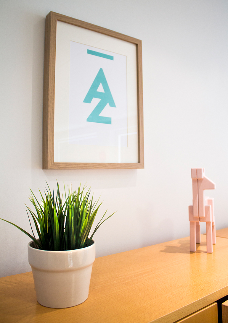
A - Z
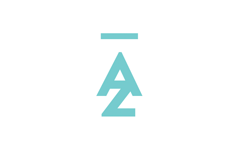
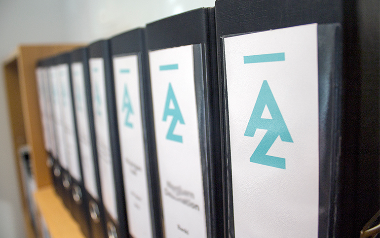
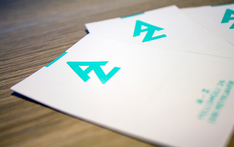
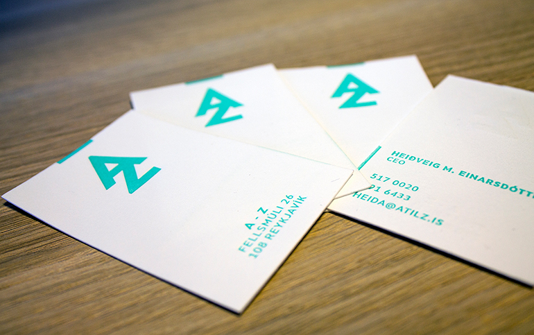
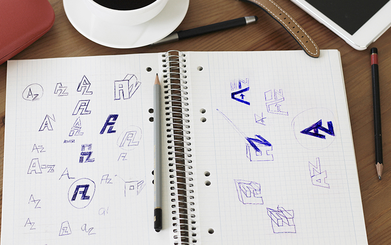
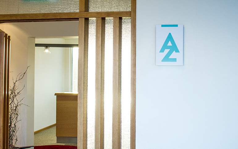
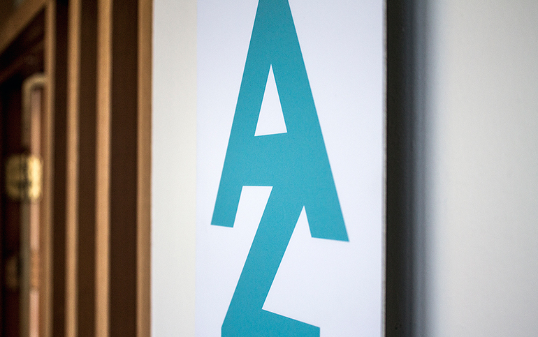
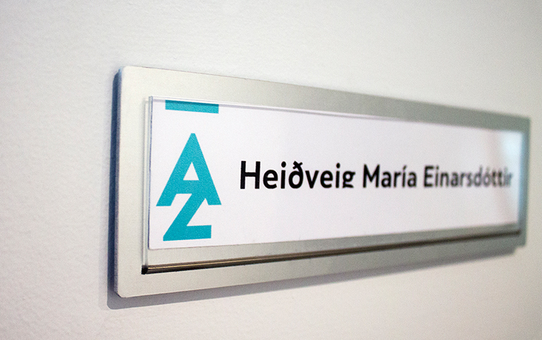
The A– Z logo was carefully thought out to be minimalistic, unique and bold. It is smartly designed in a way that you can see all of the elements of the company name A – Z in it. The company provides all kinds of service (everything from a-z) from finance to marketing. Also the logo has hidden meanings; not only does it have [zig zags] which represents the adventure and trail they are ready to overstep for their clients, but it also has a mountain and a lake running from it, which refers to their location, which is Iceland.
It won the award "Reader’s Choice Best of Show Logo Design" and was chosen one of the 10 best logos in the HOW Design 7th annual logo design awards
- Categories: Branding, logo design
- Client: A - Z
